
A well-made business banner can grab attention on a crowded street or scroll feed, and it does far more than display a logo. Good banners guide the eye, sell a message, and invite a quick action without overwhelming the viewer.
The following five tips focus on practical layout moves, clear messaging, and sensible visual choices that keep your brand voice steady. Use these tactics as a blueprint to sharpen impact and cut through visual clutter.
1. Prioritize Visual Hierarchy
Clear hierarchy directs the viewer from headline to image to call to action, making the message instant and easy to parse. Use size, weight, and placement to mark what matters most so that the eye follows a natural path across the banner.
Group related elements together so the brain can chunk information quickly and move on with a decision. A strong headline, medium subtext, and bold CTA form a reliable three-tier structure that reduces confusion.
Limit competing elements so hierarchy stays intact and scanning is fast, even at a glance or from a distance. Negative space around the key message amplifies its value and gives breathing room to every element.
Align text and imagery on a grid to keep relationships predictable and tidy, which helps viewers process information without effort. Small tweaks in spacing or scale often yield big gains in clarity.
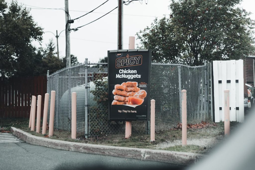
2. Use Strong Contrast And A Limited Color Palette
Contrast is the telescope of visual design; it pulls primary elements forward and pushes less critical details back. Select contrasting tones for text and background so legibility holds at arm’s length and on small screens, and keep color choices tight to avoid sensory overload.
A short palette of two to four colors that harmonize with your brand keeps the look cohesive and sharp. Texture or subtle gradients can add depth without stealing spotlight from the headline.
Think about light and dark values first, then layer accent colors for emphasis rather than decoration. High contrast between text and background improves readability under varying lighting conditions, which matters for physical banners in sunlight or digital ads on bright displays.
Use color sparingly to highlight the CTA or key phrase, and let contrast do the heavy lifting for quick comprehension. Small, deliberate pops of hue guide the reader where you want them to go.
If you’re looking to enhance visibility and draw new residents, professionally designed apartment banners can instantly elevate your property’s curb appeal and reinforce your brand identity.
3. Choose Readable Typography
Typeface choice sets tone and guides interpretation, so pick fonts that read well at multiple sizes and distances. Sans-serif families often offer clean legibility for headlines and body lines, while a single complementary serif can add a touch of formality without clutter.
Keep font pairings limited and use consistent letter spacing to avoid visual noise that fights for attention. Large display type for headlines with modest-weight secondary text preserves balance and keeps the message crisp.
Avoid overly stylized fonts that look neat up close but blur into an indecipherable mess from five feet away, where most banners are judged. Test type at actual scale and on different media so spacing, kerning, and line length all feel right when viewed quickly.
Bold or condensed weights work well for short, punchy phrases, while regular weights support longer lines that still need to be read fast. When in doubt, less flair and more clarity win out.
4. Keep Messaging Short And Actionable
A banner is not an essay; it must make a single point and invite a short response or next step. Use a clear headline, a supporting line if needed, and one direct action phrase that tells viewers what to do next, such as visit a site, scan a code, or stop by a location.
Short, active verbs work best because they reduce cognitive load and speed decision-making under brief exposure. Every extra word raises the bar for recall, so trim copy down to essentials.
Align the message with the visual hierarchy so the CTA sits where the eye finishes, not where it gets lost in the middle. Replace passive phrasing with active commands and keep numeric or time-limited offers prominent to add urgency.
When space is tight, swap long words for simple ones that carry the same weight and keep grammar straightforward for faster uptake. Test a few versions and pick the one that communicates fastest and cleanest.
5. Balance Imagery With White Space
A strong image can tell a story in a split second but it should never fight with text for dominance on the canvas. Choose images that support the headline and crop them to preserve focus, then leave ample white space so typography breathes and the overall message reads at a glance.
Photographic subjects that show clear action or relatable faces perform well, but abstract shapes or icons can be more versatile when clarity is king. The key is to match image content to the promised action so the whole banner feels united.
Whitespace is not wasted space; it is a design tool that frames content and reduces noise so essential elements stand out. Use margins and gutters to separate headline, body, and CTA, then let the empty zones guide the eye toward the action.
Scale imagery modestly when text is the priority and punch images up when visual storytelling is the lead. A tidy balance between picture and pause keeps the viewer focused and more likely to take the next step.